Welcome to Promise Zones on Github
This started as a 2016 National Day of Civic Hacking Challenge: Data Visualization for Obama Administration’s Promise Zones.
![]()
Our goal is to help visualize how the promise zones stand in comparison with other areas of the US, and to help identify other areas that may be good candidates for future promise zones.
Visualizations
Promise Zone Builder
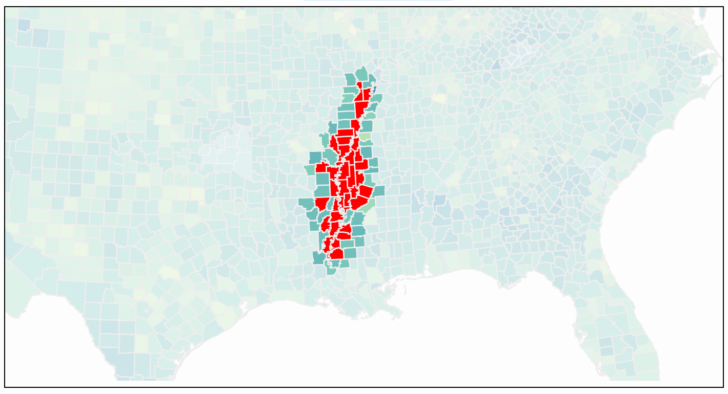
Promise Zone Builder allows anyone to create his or her own Promise Zone by clicking on a map of United States counties. Start by clicking on a dark blue county, where poverty is at its worst. Then build the promise zone by clicking the “Neediest Neighbor” button. See how many people would be affected by designating the area as a Promise Zone. Once you create a Promise Zone, the parameters are stored in the URL, so you can share it with others.
- The southern Mississippi River region is a prime opportunity for a Promise Zone
- Central Alabama and Mississippi
- Southern Texas along the Rio Grande
- The rural Desert Southwest
- Tell us what you find!
Comparison Graph
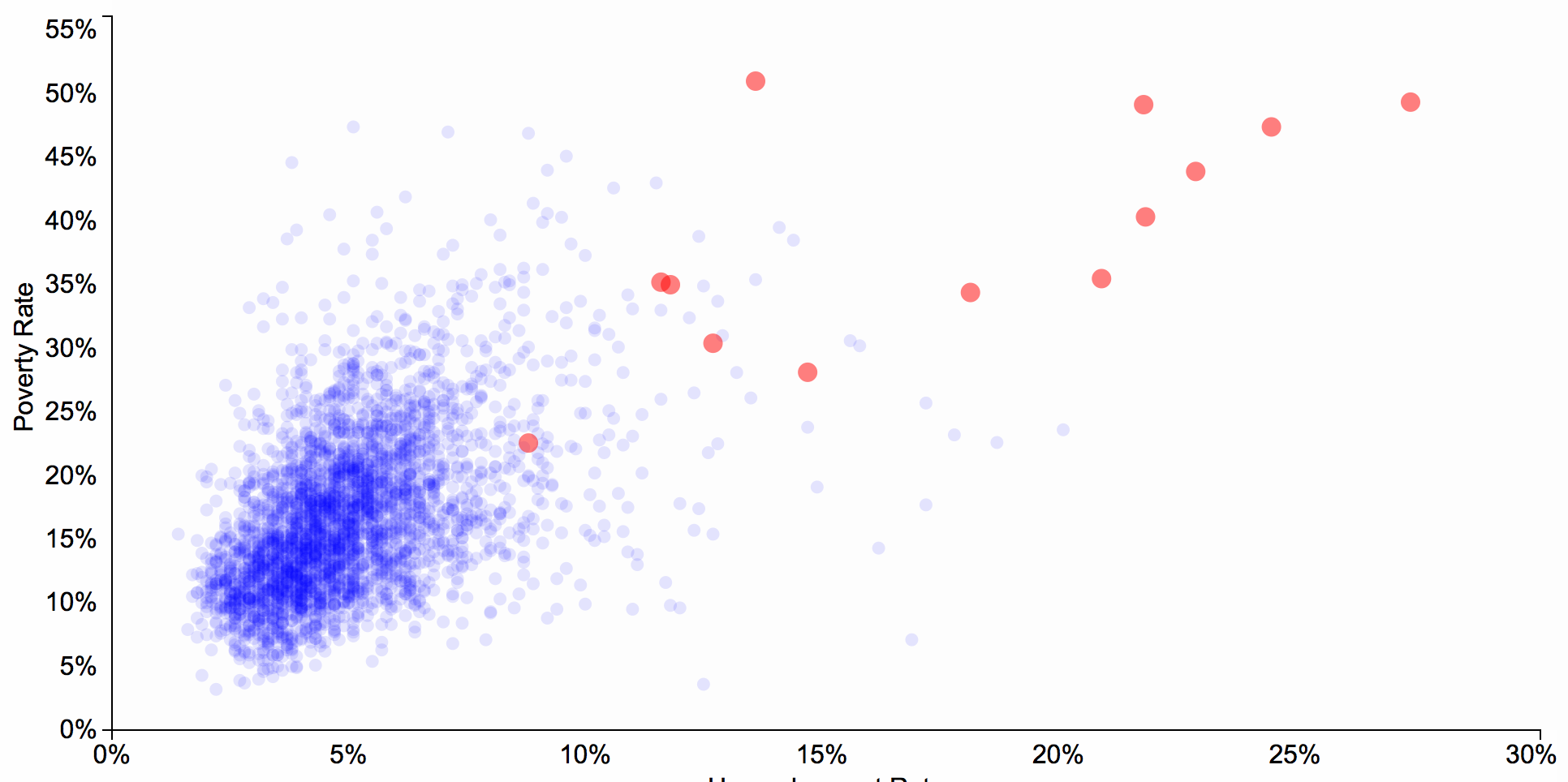
Comparison Graph plots poverty rate vs. unemployment on x-y coordinates, and shows where each county in the US falls. It also shows the promise zones in the same graph in red, so you can see how they compare to the rest of the country. You can also see other “blue” areas that are similar to where the promise zones lie, those may be good candidates for future Promise Zones. We have also ranked each location, including the Promise Zones, by which ones might be good candidates for future Promise Zones. It is important to note that this is based on poverty rate and unemployment rates only, right now it does not take into consideration any other factors like crime rates.
What is a Promise Zone?
In his 2013 State of the Union address, President Obama laid out a plan “to designate a number of high-poverty urban, rural and tribal communities as Promise Zones, where the federal government will partner with and invest in communities to accomplish the following goals: Create jobs, leverage private investment, increase economic activity, expand educational opportunities, and reduce violent crime.” Read more here and here.